Comcast NBCUniversal
I’ve had the fantastic opportunity to join Comcast's Learning and Development team during a rebranding initiative. As the senior visual designer, I played a key role in shaping the direction of our new brand, which has involved complex sub-branding for various portfolios, businesses, and products.
I have the privilege of collaborating with various businesses, including Xfinity, Xfinity Mobile, Comcast Business, NBC, and Universal Studios. Through these partnerships, I've acquired invaluable experience in becoming an adaptable designer capable of working seamlessly with diverse teams, each with its unique working style.

Where it all started
In 2021, the creative team launched and was handed the initial brand work created by a vendor for what would now be called “ULearn,” Comcast’s internal Learning and Development group. The brand consisted of a logo, a limited PowerPoint template and a reference guide of a few pages.

A basic template
This image previews the organization's PowerPoint template at the time. PowerPoint is widely used across the department for teams, stakeholders, business partners, and learners through facilitators.
Developing a brand in real time
Over the past three years, our team has strategically introduced incremental updates, adding depth and strengthening the foundation of this humble brand. Simultaneously , we've built products within the brand, created sub-brands, collaborated on co-branded moments, and remained agile amid shifting business priorities. As the senior designer on the team, I bring a systems thinking mindset to the table and have played a significant role in the evolution of our current ULearn brand. I couldn’t be prouder of how far we’ve brought the organization today.
Key Components
Quick links on our brand site provide easy access to our most referenced brand components, offering a snapshot of the brand's key elements.

Brand Hub Site
One of our biggest achievements was expanding our brand guidelines from a few PowerPoint slides to a comprehensive 120-page PDF over the years. This year, we took it a step further by transforming that content into a website, making the information easier to access and the files simpler to find.

New PowerPoint Organization Template
This might be the accomplishment I’m most proud of, as it was entirely my project from start to finish. Designing an engaging, well-crafted template that is both user-friendly for non-designers and robust enough to meet the organization’s diverse PowerPoint needs was no small task. The final template features 35 master slides, 70+ pre-designed grab-and-go slides, and a resource library ready for any presentation. It includes editable charts, graphs, infographics, icons, and illustrations, all designed with accessibility in mind to ensure everyone can interact with our content.

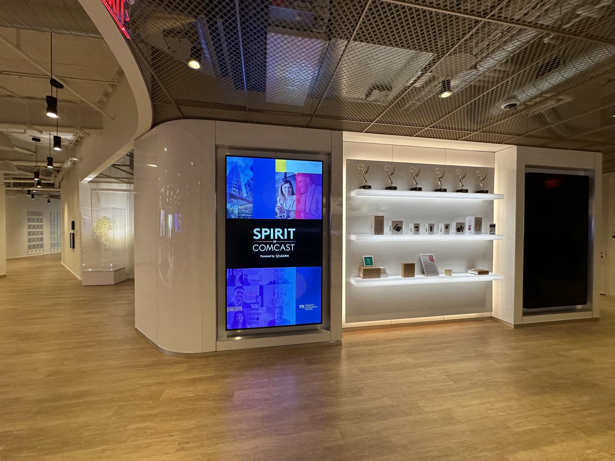
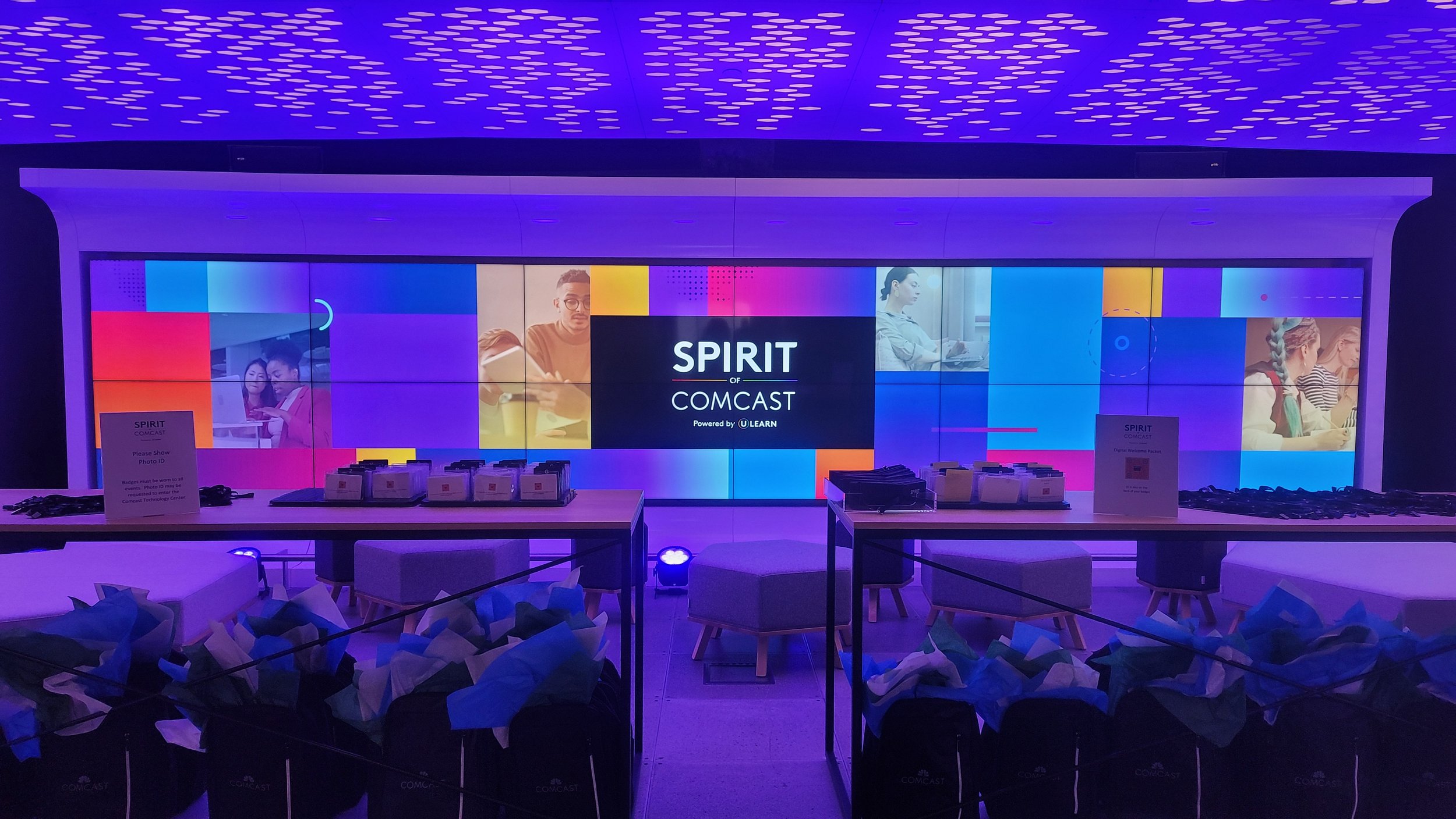
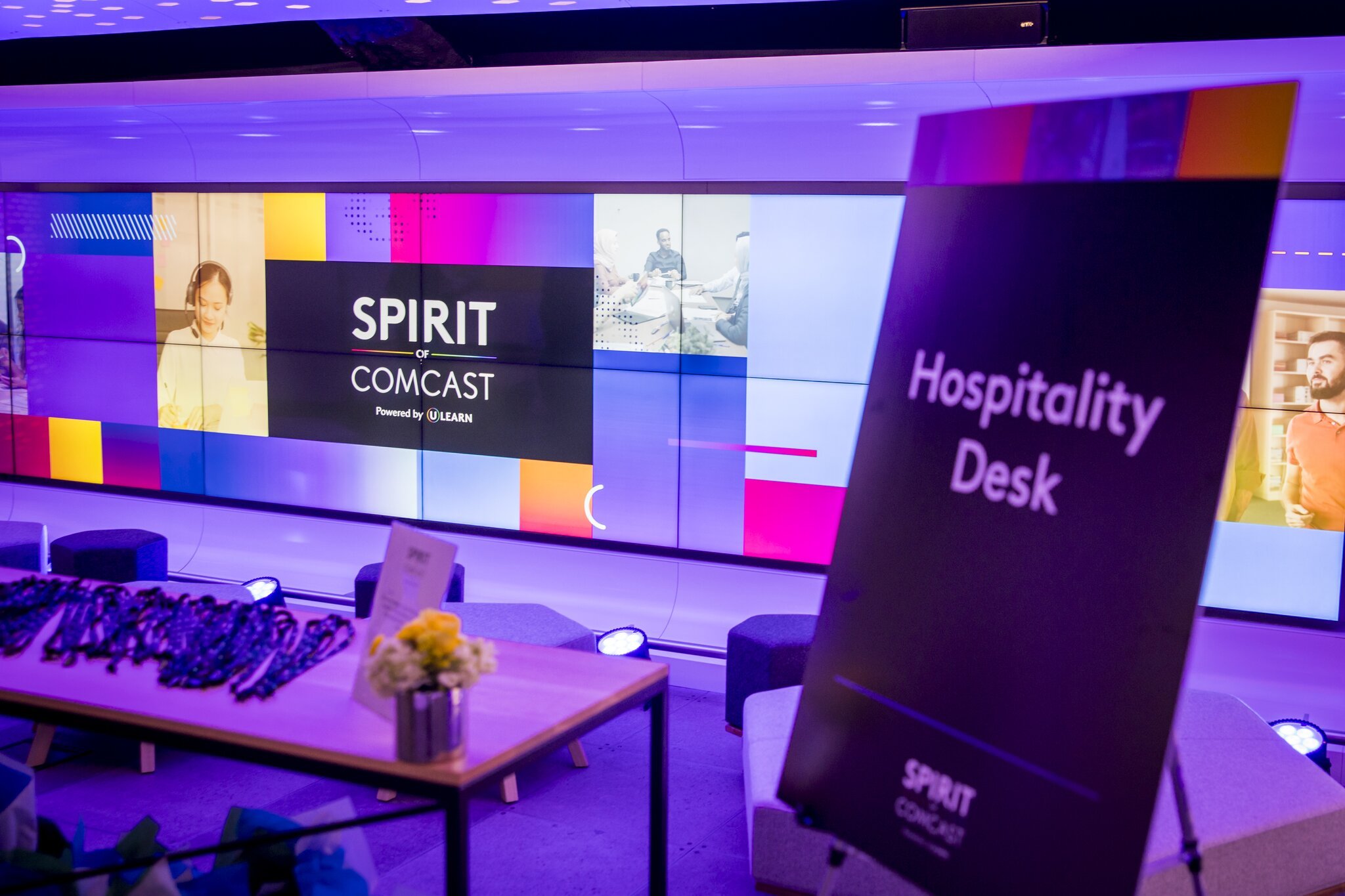
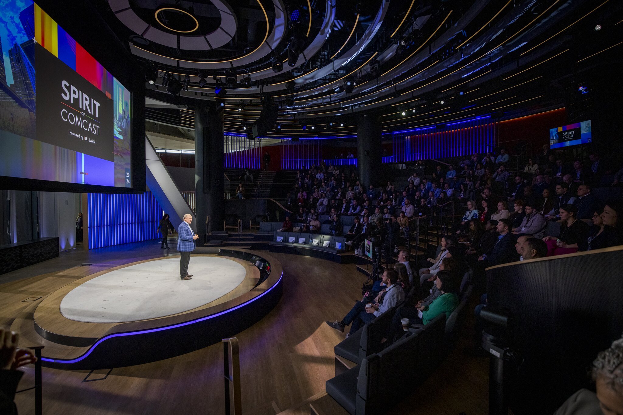
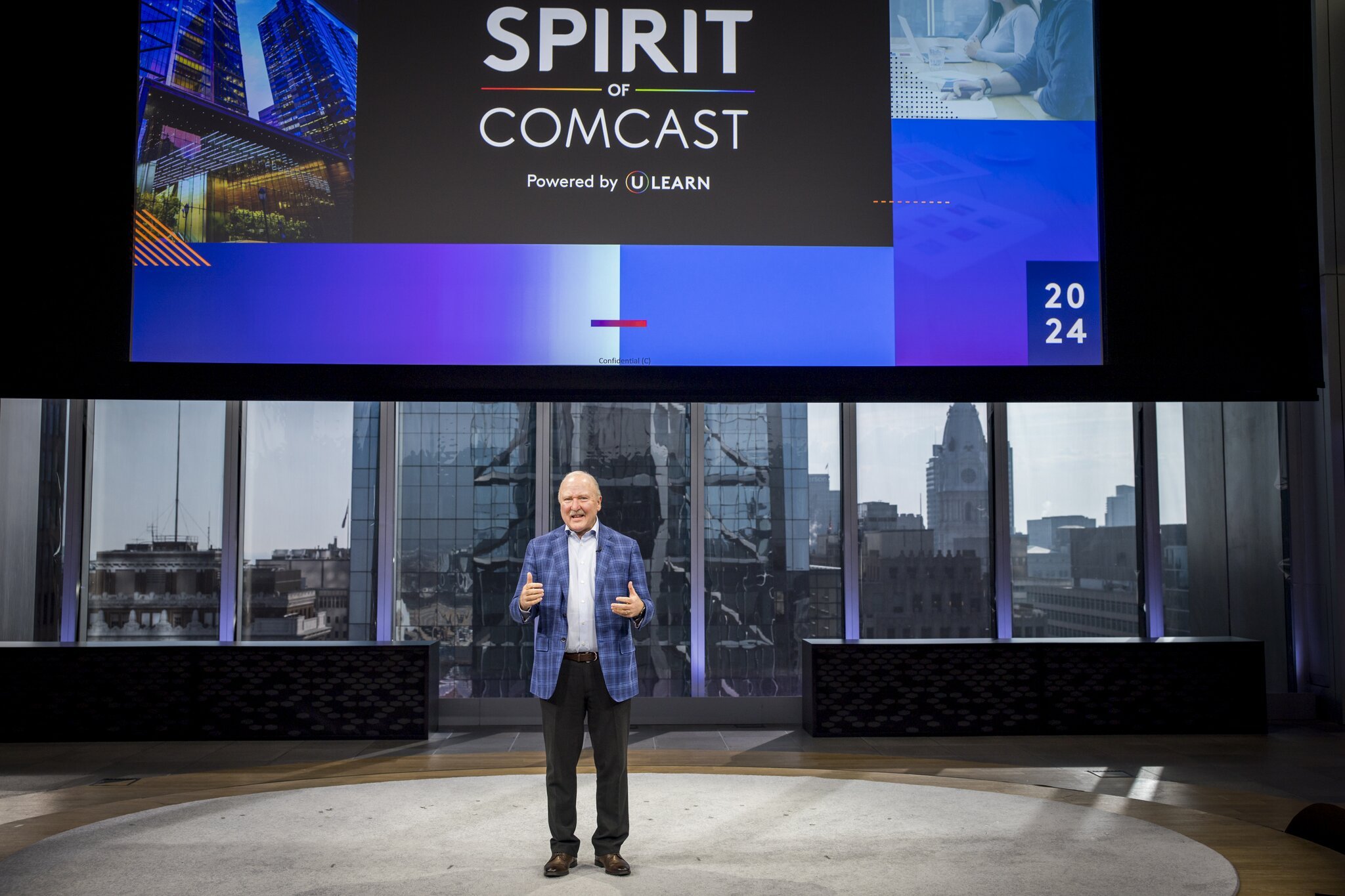
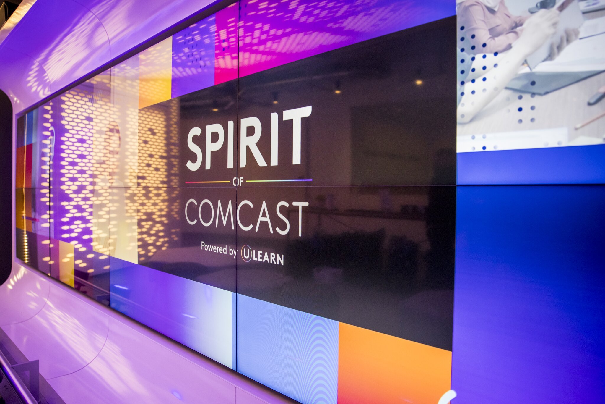
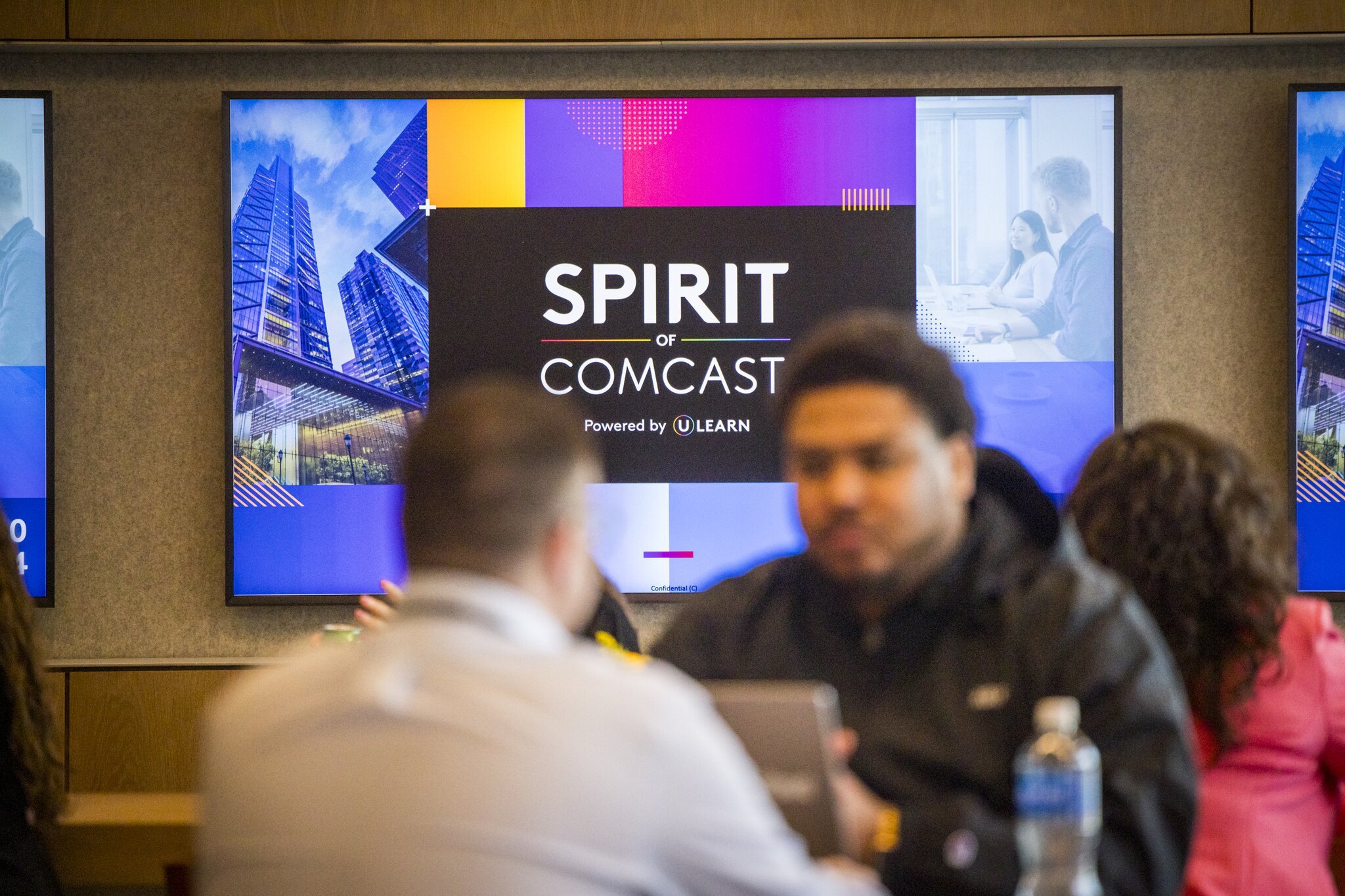
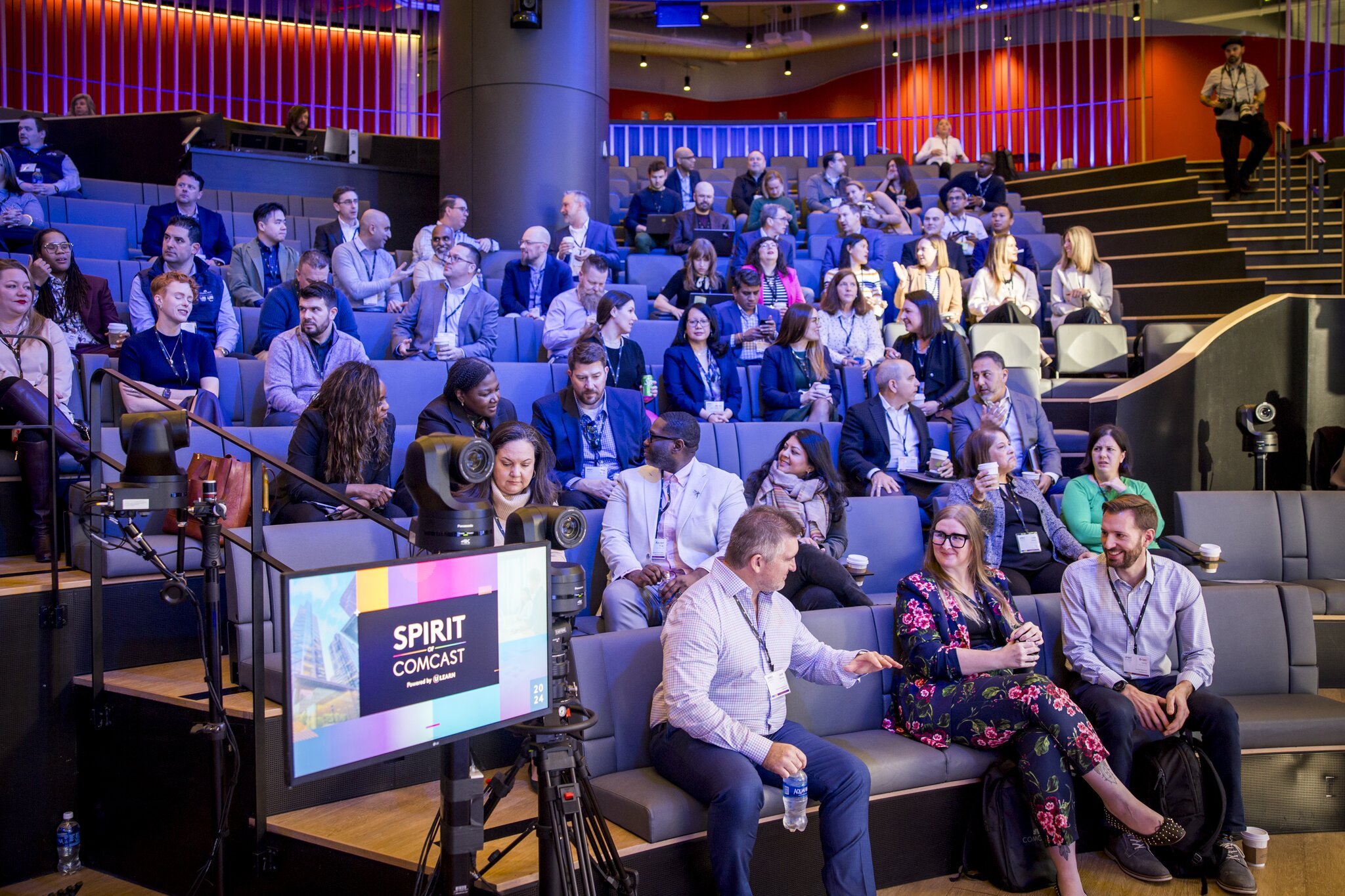
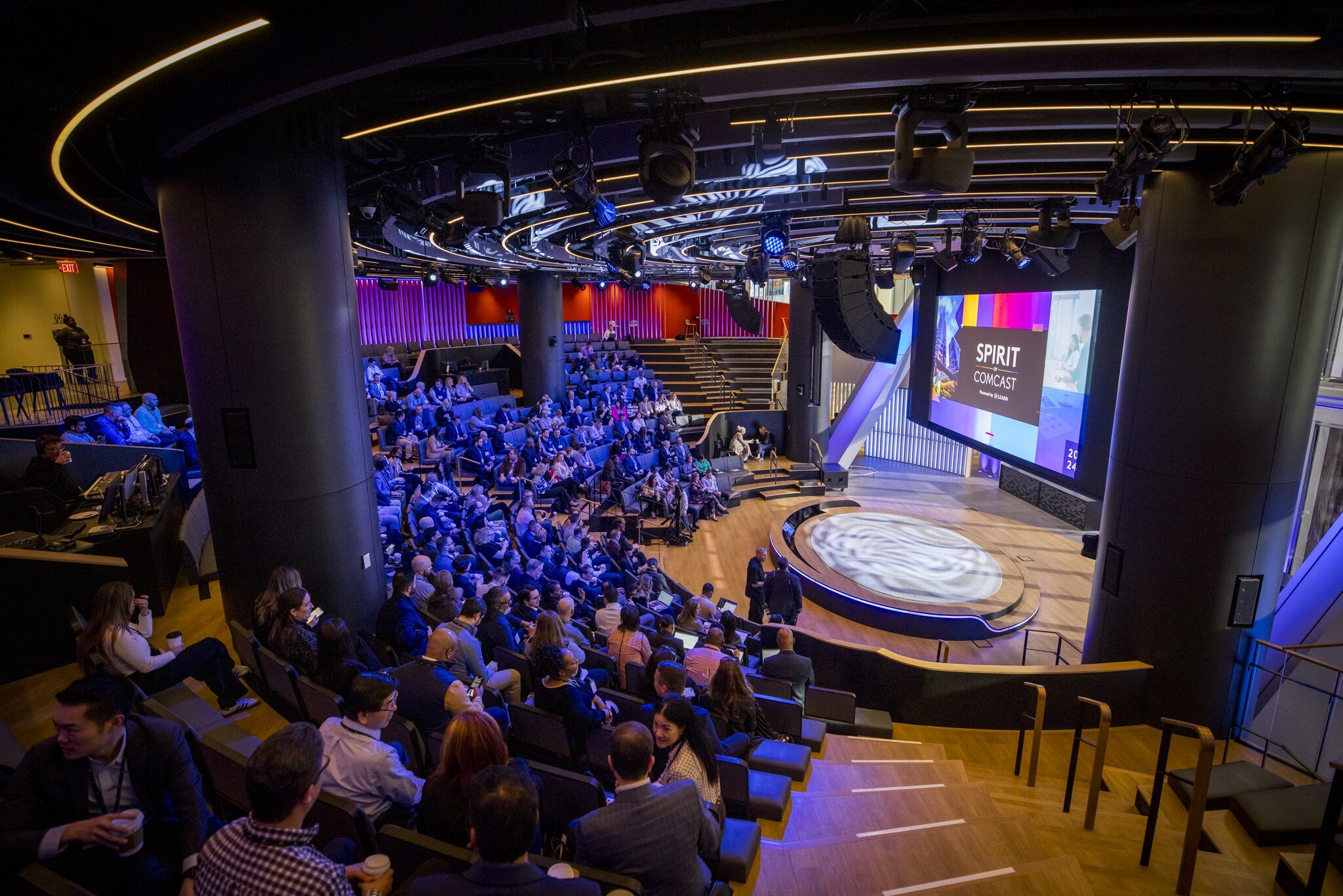
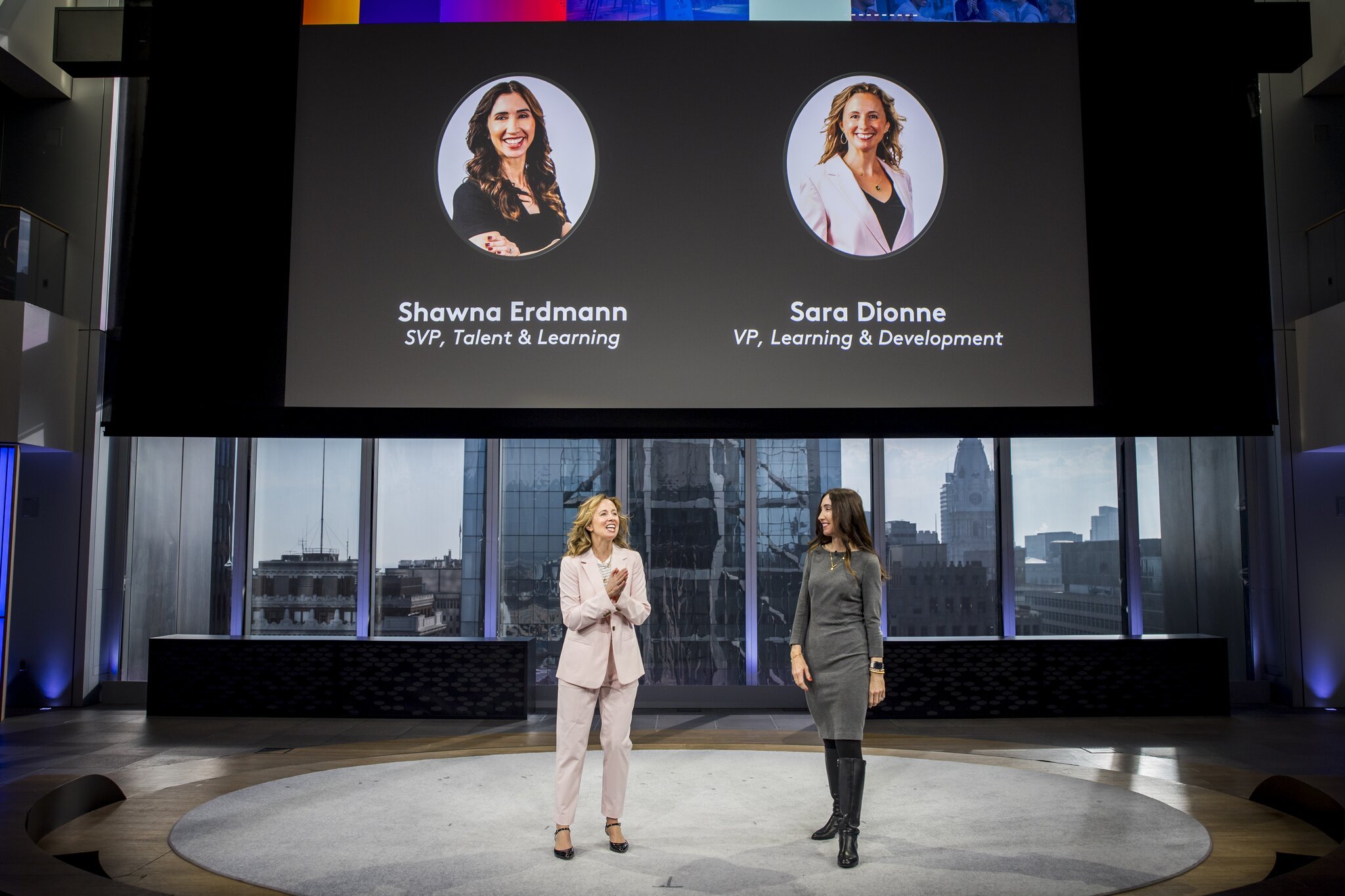
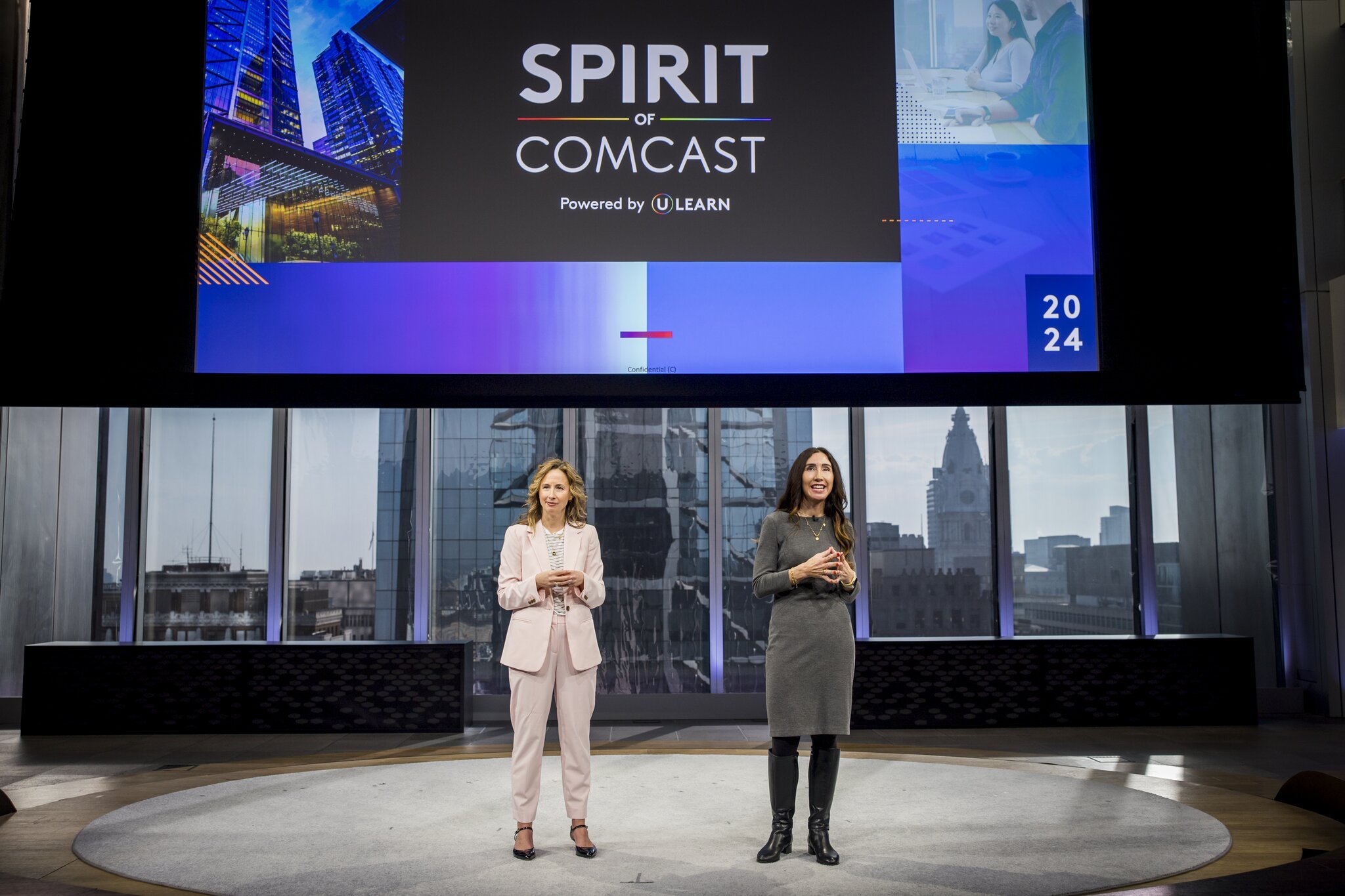
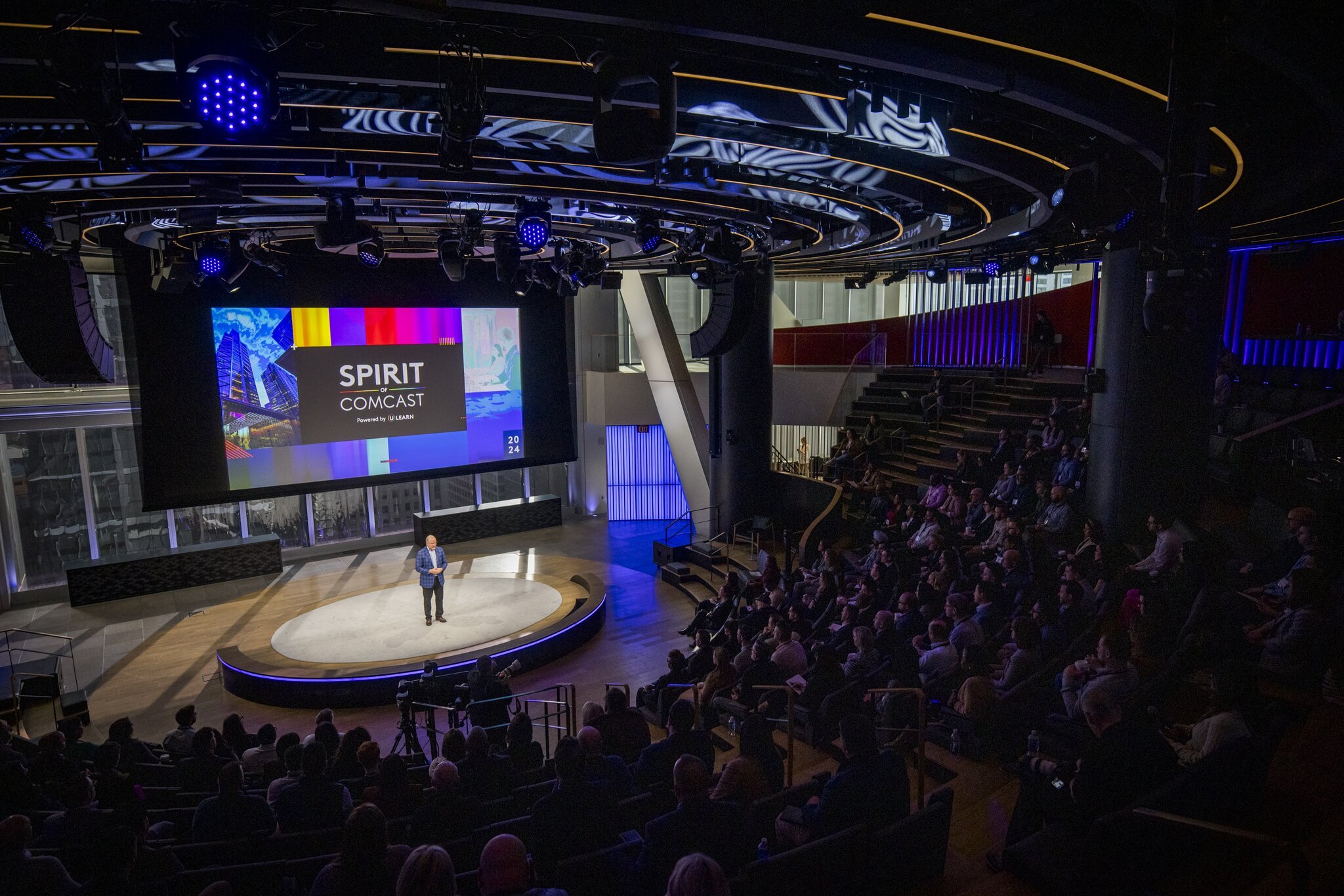
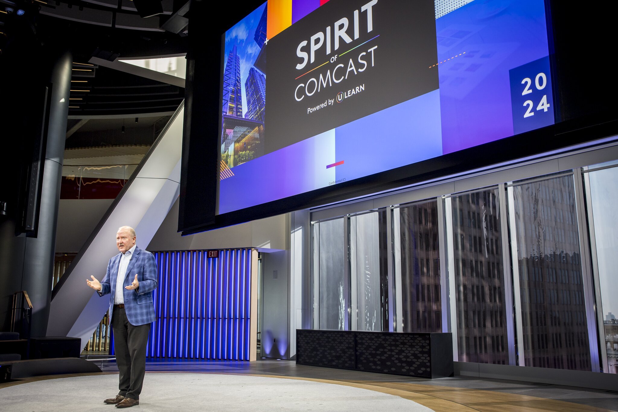
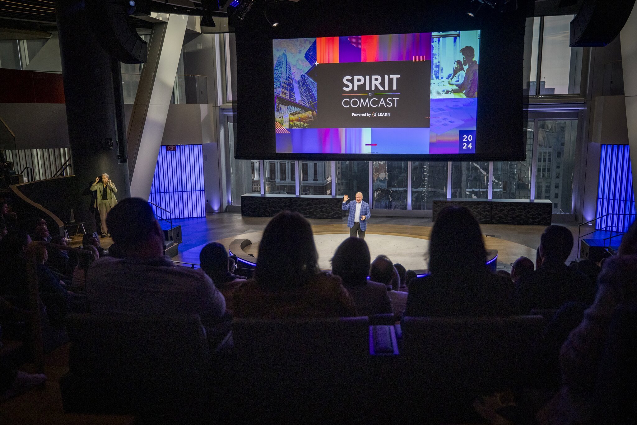
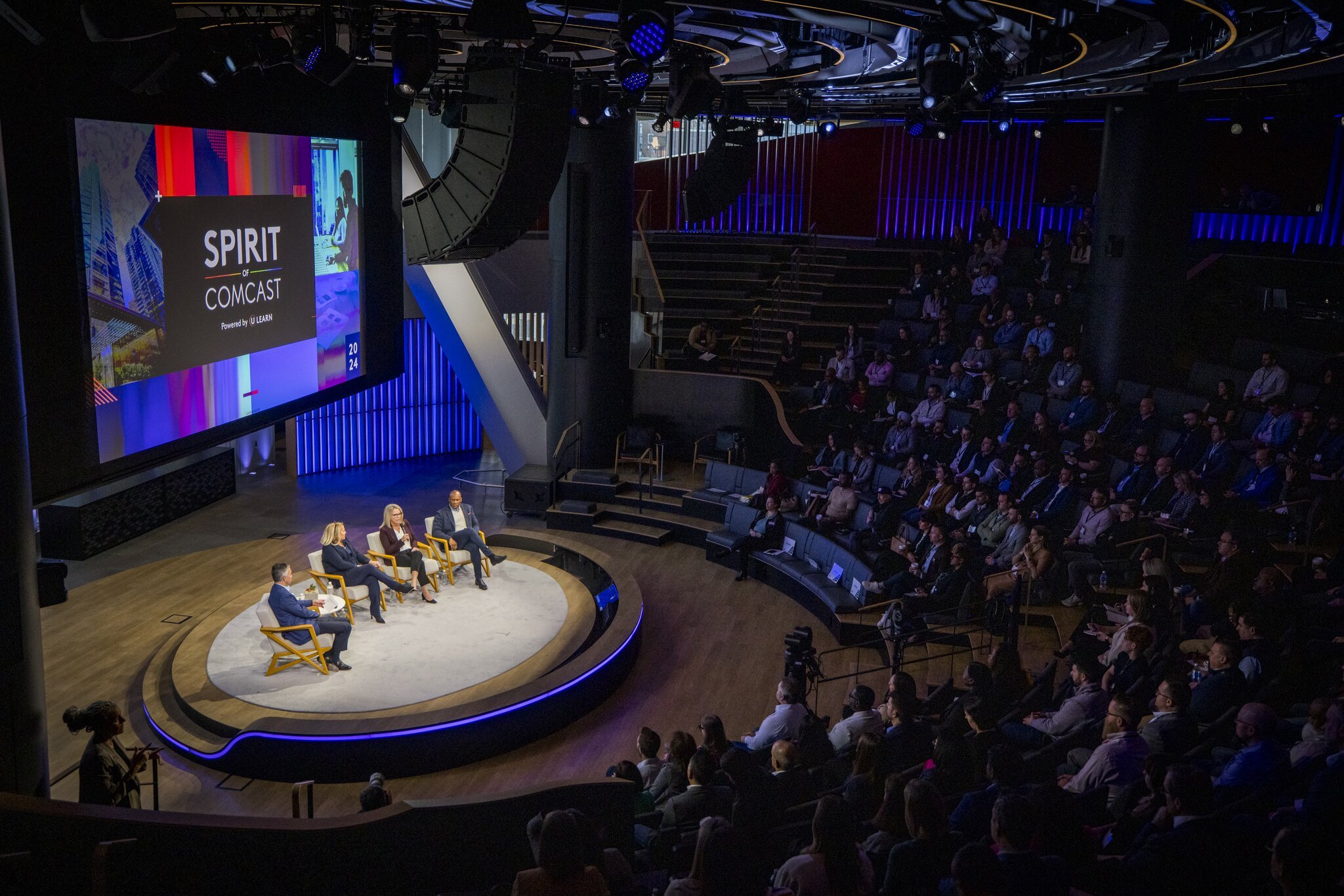
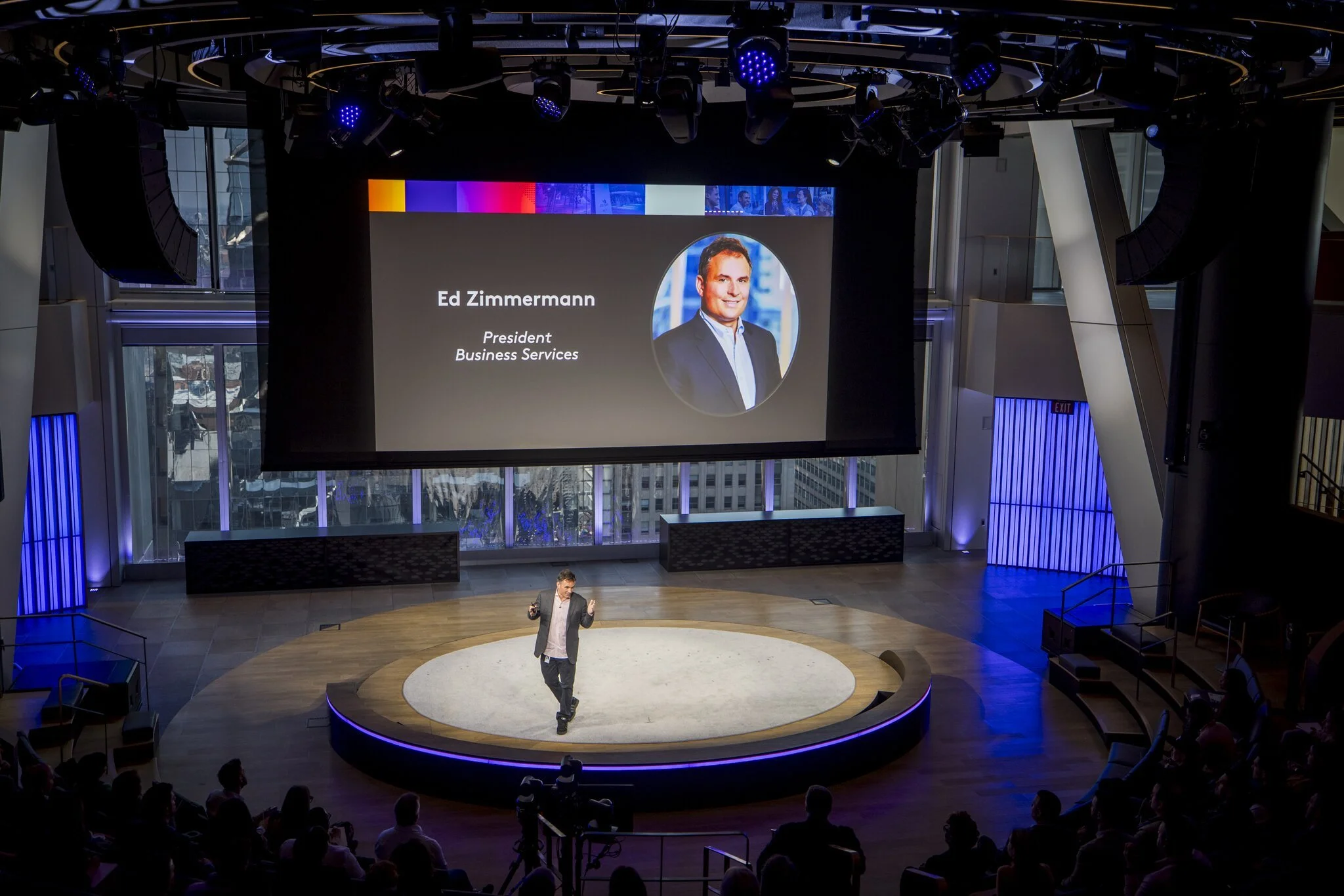
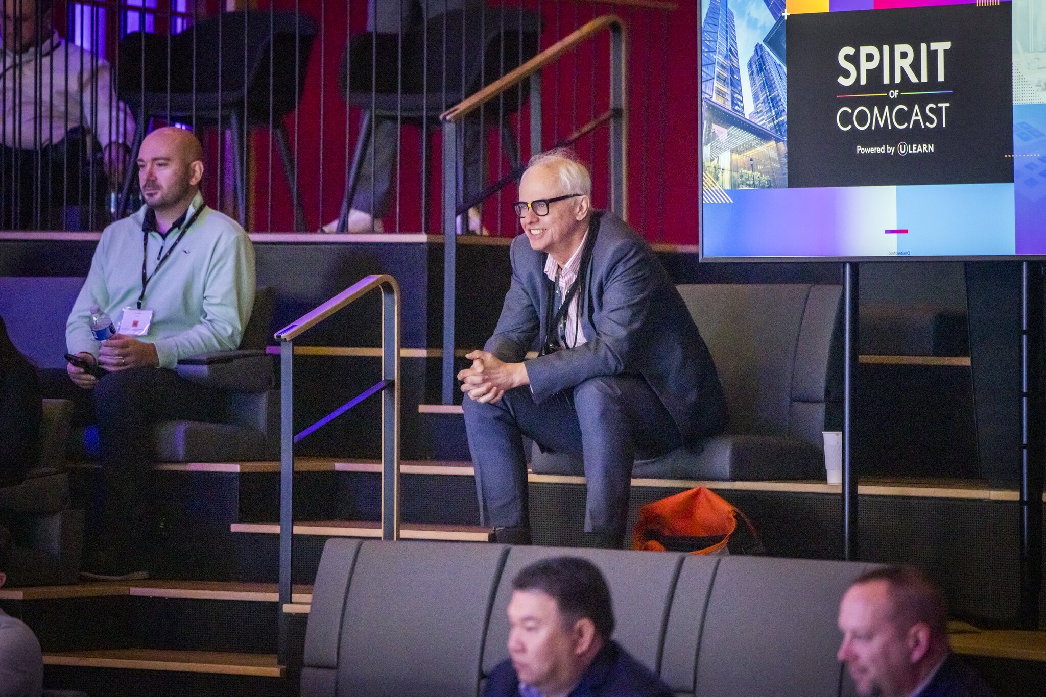
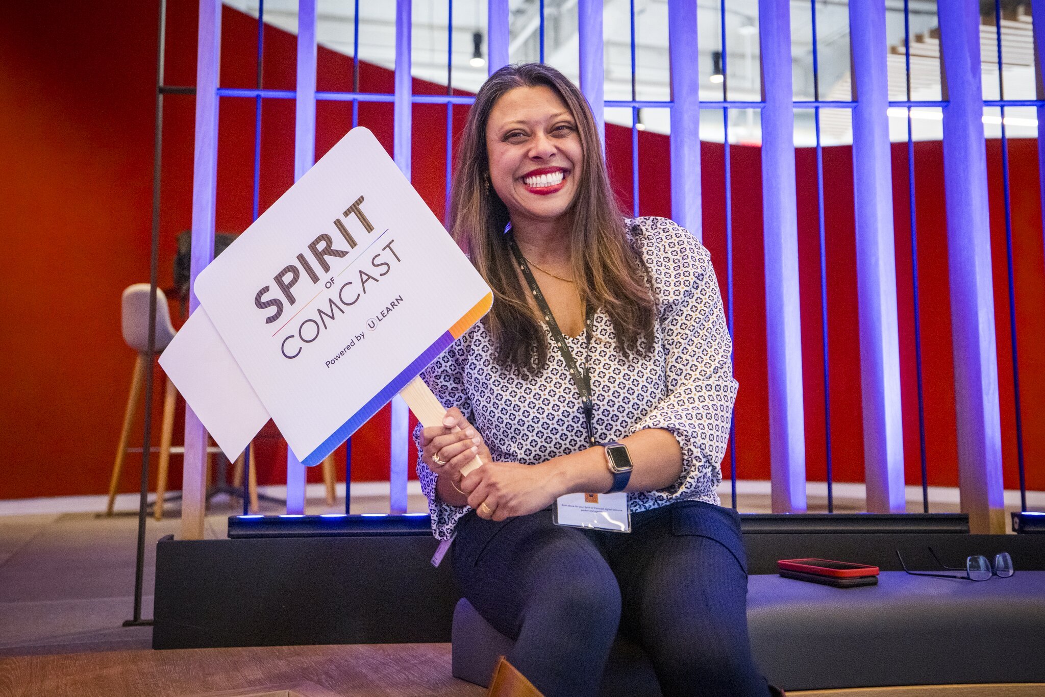
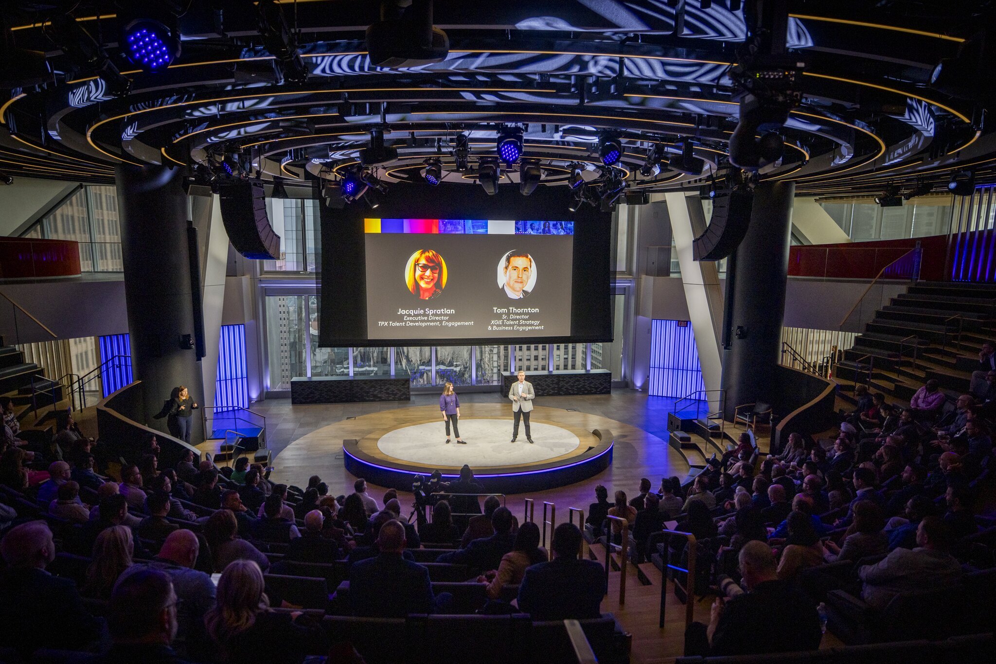
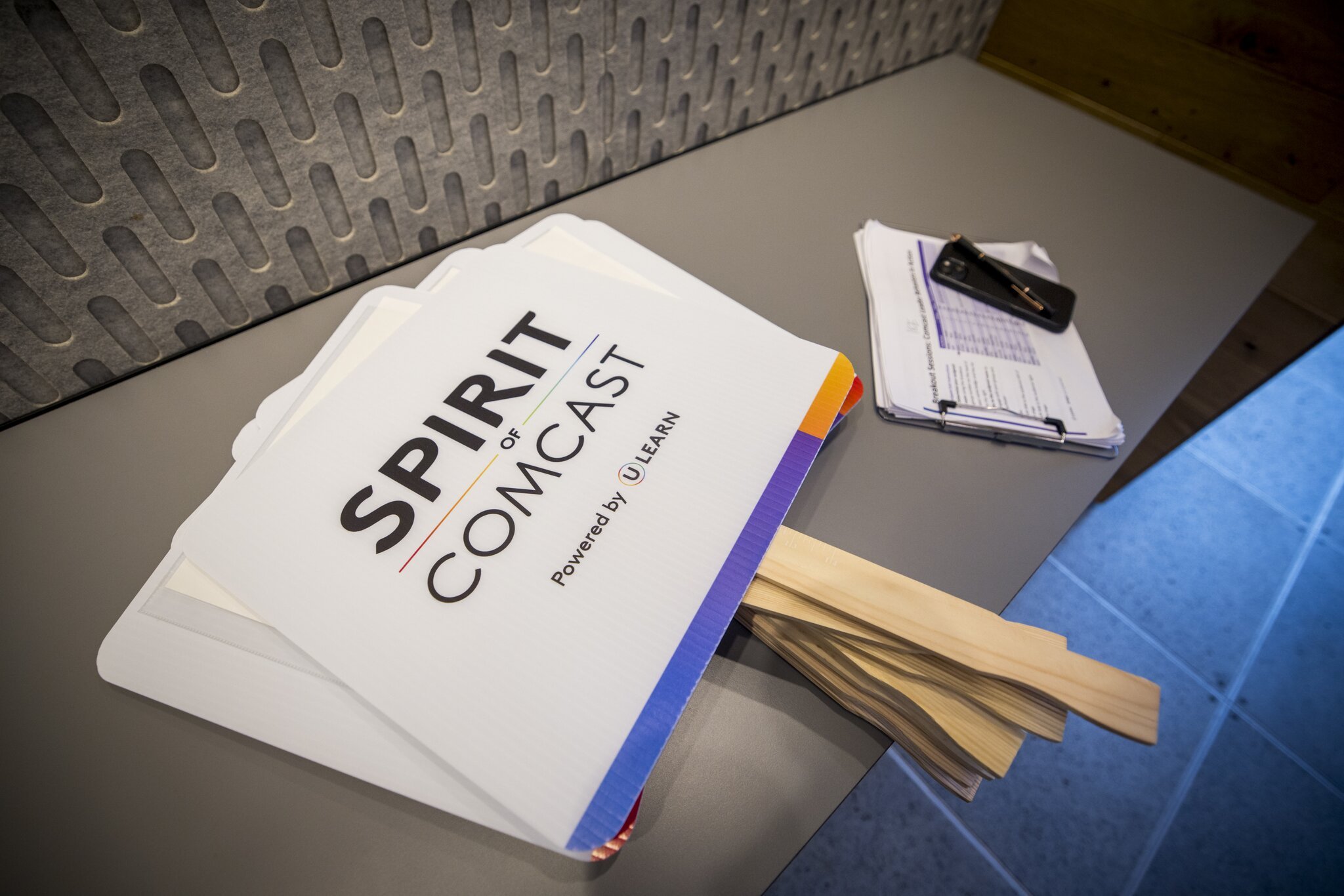
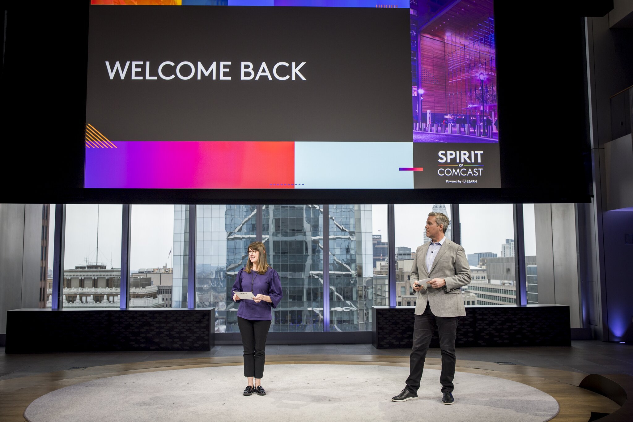
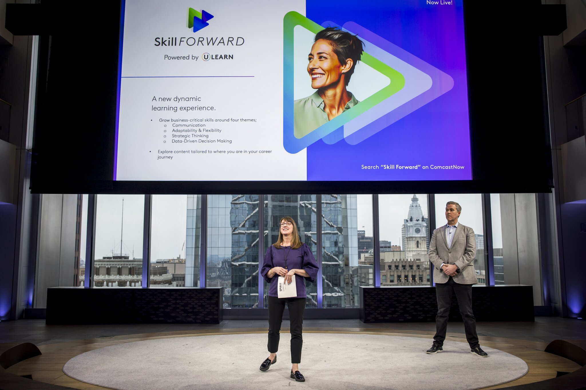
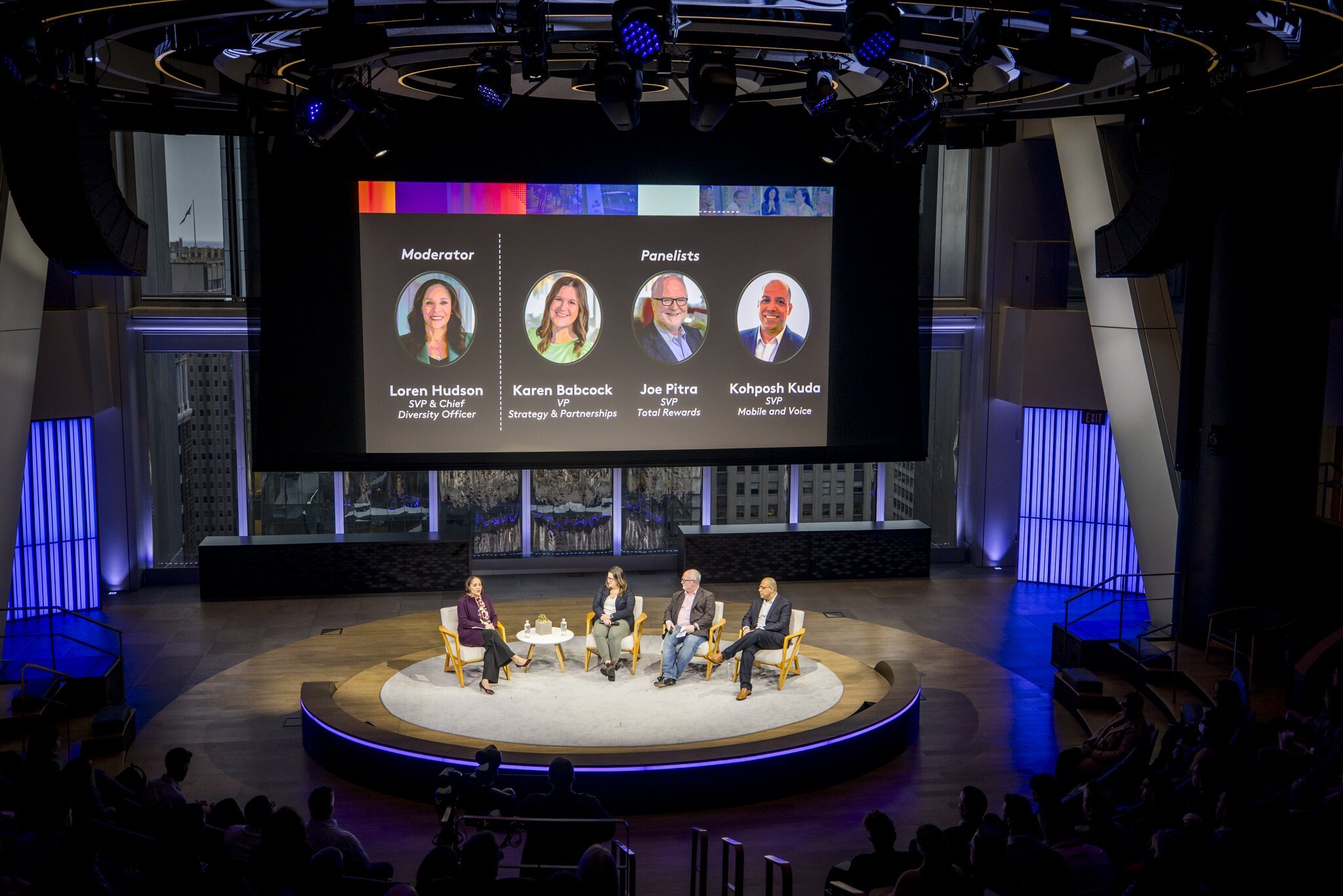
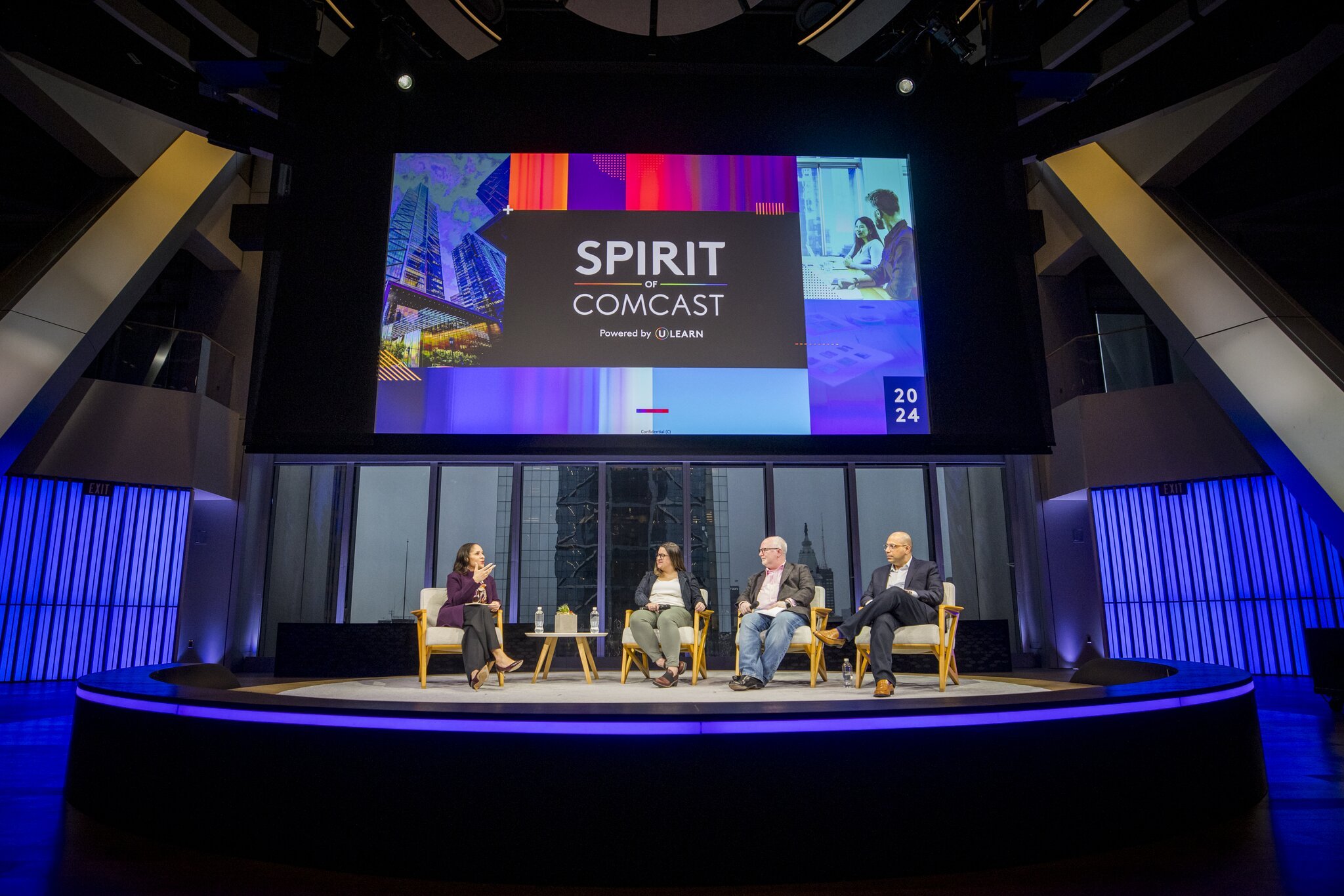
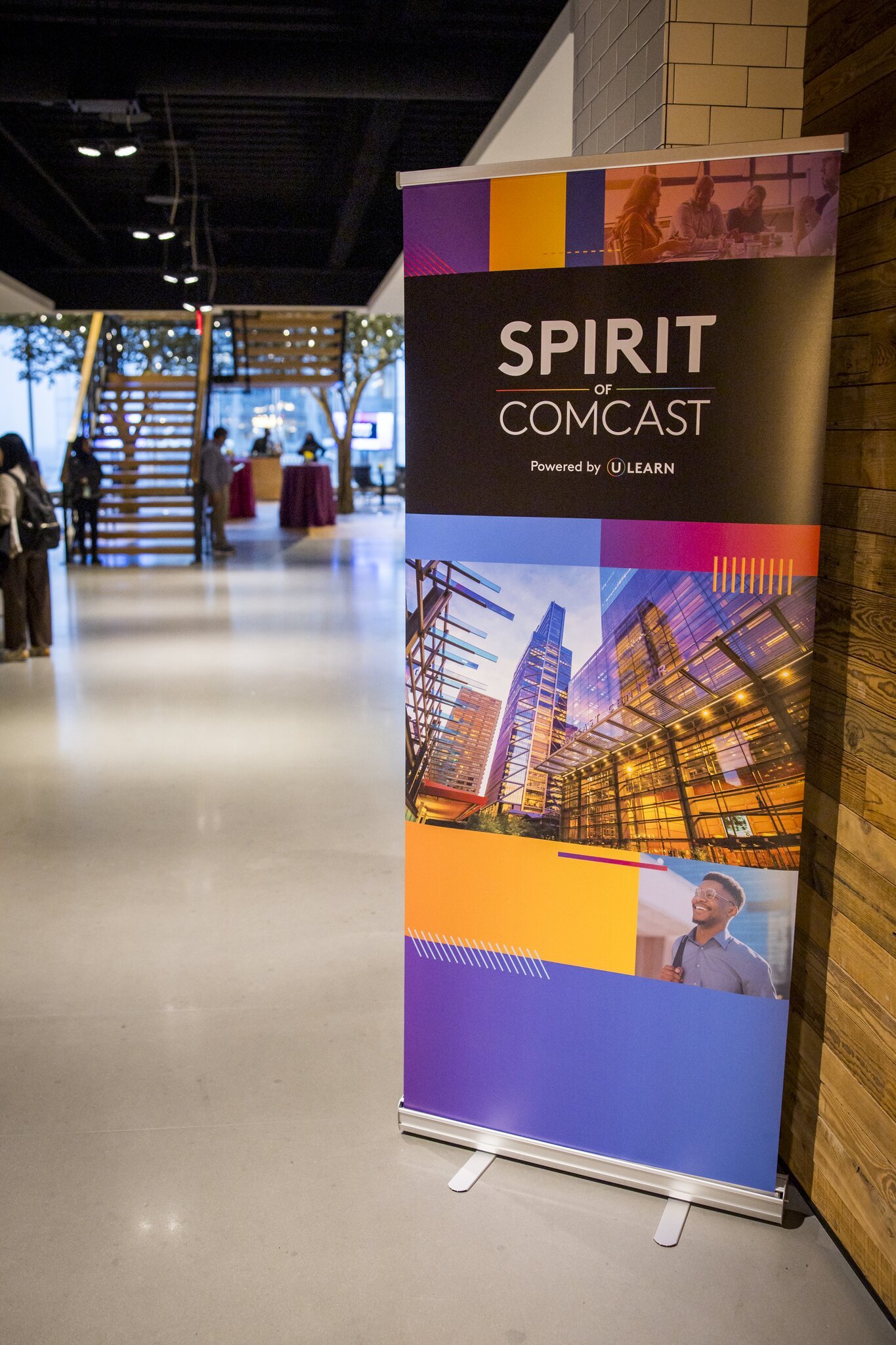
Spirit of Comcast
Spirit of Comcast is a reoccurring event held at Comcast headquarters for new leaders across the nation, where excellence and innovation is celebrated. I was honored to create the branding and all print and digital assets for this event.

Co-branding development for Xfinity/ULearn white label course. Developed branding system, guidelines and template for team to create courses in Articulate Storyline.

Marketing piece for a flagship program announcing new UX updates. Skills: Branding, layout, marketing, writing/editing, icons, systems thinking, UX

3 frames from a video promoting Comcast's values for all employees. Skills: Design, illustration, storyboarding, icons, branding

Preview of self-directed online course. Skills: branding, layout, UI, illustration
Preview of self-directed online course. Skills: branding, layout, UI, illustration
Presentation design. Helped develop initial PPT template for Learning & Development division. Use of sub-branded colors for a product specific presentation. Skills: presentation design, branding, icons, infographics, illustration, layout.
